PromptCoder-Cursor专注前端,让代码生成工具更智能

【PromptCoder + Cursor】:专注前端,让代码生成工具更智能
【PromptCoder + Cursor】:专注前端,让代码生成工具更智能
Cursor 最近也是火遍了编程圈子,不管是前端后端还是算法都在尝试使用 Cursor 写一些东西。
我用的最多的应该是 Composer,由于我是前端程序员,用 Cursor 最多的时间就是在让它写样式。虽然目前cursor写纯前端的代码几乎不会报错,但无论是截图还是写大量prompt,它总是难以还原设计稿的样式。正好,最近发现了一个专注于代码提示词的生成工具 PromptCoder ,让我完美还原了设计稿!
什么是 PromptCoder
PromptCoder是一款创新的智能代码生成工具,它能够识别设计图或截图,并自动生成与之匹配的前端代码。无论是复杂的交互组件还是简洁的静态页面,PromptCoder 都能帮助你轻松复刻一个完整的页面或原型图,极大地提升开发效率,减少手动编码的时间和错误率。
这款工具支持多种前端框架,如React、Vue、Flutter等,使得开发者可以无缝集成到现有的项目中。PromptCoder的目标是简化开发流程,减少手动编码,让开发者专注于创意和用户体验。它有几个特点:
- 交互简单易用: 通过图像识别技术,PromptCoder能够理解设计意图。只需一张截图即可得到想要的效果。
- 从免费开始: PromptCoder 只需注册即可免费体验全部内容。
- 多框架支持:PromptCoder 现在已经支持 Next,React,Vue 和 Flutter 等框架。
案例:商城页面搭建
假设我们需要为一个电子商务网站创建一个动态的首页,这个页面需要包含商品展示、搜索功能、用户登录和购物车等组件。
步骤1:设计首页布局
设计师提供了一个首页的布局设计图,包含了上述所有组件的布局和样式。
步骤2:使用PromptCoder生成提示词
将设计图上传到PromptCoder,工具自动识别设计图中的各个元素,并根据如下的框架生成提示词:
···
使用React框架构建页面。
使用CSS Grid布局实现响应式设计。
商品展示区域使用卡片布局,每个卡片包含商品图片和名称。
搜索框位于页面顶部,支持自动完成功能。
用户登录和购物车图标位于页面右上角。
···
PromptCoder继续为每个组件生成详细交互逻辑提示词。例如,ProductGrid组件会接收一个商品数组作为props,并为每个商品渲染一个卡片。
代码框架如下:
import React from 'react';
import './Home.css';

const Home = () => {
return (
<div className="home-container">
<SearchComponent />
<ProductGrid products={products} />
<LoginButton />
<CartIcon />
</div>
);
};

export default Home;
步骤 3:使用 Cursor 编写代码
将生成好的提示词复制给 Cursor Composer Agent,等待 Cursor 生成代码即可!
完整提示词示例:
Create detailed React components with these requirements:

1. Use functional components with arrow syntax and proper TypeScript types
2. Style with styled-components or CSS Modules for maintainable CSS
3. Use @heroicons/react for icons (from @heroicons/react package). Do NOT use other UI libraries unless requested
4. Use stock photos from unsplash.com where appropriate, only valid URLs you know exist
5. Configure webpack/vite image loaders to enable stock photos from unsplash.com
6. Avoid duplicate components and implement proper code splitting
7. Follow component folder structure: /components/{common,features,layouts}
8. Follow proper import practices:

   - Use absolute imports with path aliases
   - Keep component imports organized
   - Update component files with comprehensive code
   - Don't forget proper TypeScript types
   - You MUST complete the entire component before stopping

   ```markdown
Layout Overview
- Page Structure:
- The main layout of the e-commerce homepage consists of a Header, Main Content, and Footer.
- Component Hierarchy:
- Header:
- Contains Logo (left), Navigation Bar (center), and Login & Cart Buttons (right).
- Main Content:
- Features a Product Showcase with individual Product Cards organized in a grid layout.
- Footer:
- Houses several Footer Links at the bottom of the page.
- Header:
- Responsive Design Considerations:
- The layout should be responsive to different screen sizes, ensuring that the navigation is accessible on mobile (e.g., hamburger menu).
- Product cards should stack on smaller screens for easy browsing.
Styling Specifications
Color Schemes:
- Utilize a neutral background color with a gradient effect for header and footer.
- Ensure bright and contrasting colors for product cards and buttons to attract attention.
Typography:
- Implement simple and clean fonts for general text, prioritizing readability and clarity.
- Product names and prices should use bold font styles to enhance visibility.
Spacing and Alignment:
- Provide ample spacing between product cards, maintaining a clean look.
- Ensure well-spaced navigation bar and footer from the main content to prevent clutter.
Animations and Transitions:
- Subtle animations on hover for product cards (e.g., shadow effect, color change) enhance interactivity.
Interactive Elements
User Inputs:
- Implement a search bar that captures user input for immediate product searches.
Navigation:
- Clicking on the category icons in the navigation bar enables a smooth transition to respective product sections.
Loading States:
- Show a loading spinner or placeholder when products are being loaded on the main content area.
Micro-interactions:
- Use subtle feedback (e.g., button glow, subtle scale change) on hover and click events for more engaging user interactions.
### 生成效果
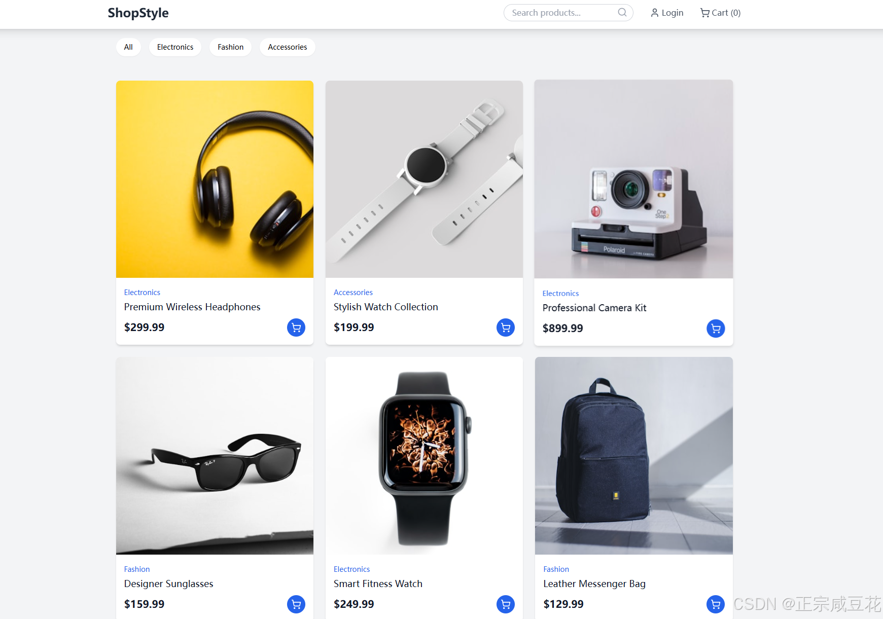
我们可以看到 PromptCoder 如何帮助开发者从设计到代码的快速转换。PromptCoder 不仅提高了开发效率,还保证了代码的一致性和质量。如果你是一名前端开发者,PromptCoder 无疑是你实现创意、提升工作效率的得力助手。